Dec. 21, 2021
You’re a high-flying flag. … But you’re probably due for a makeover.
Share this story
The flag of the United States of America dates to the 1770s. It is one of the most recognizable flags in the world and every elementary school student in the United States knows what its stars and stripes signify.
It truly has all the hallmarks of a good flag design. According to the North American Vexillological Association, there are five basic principles:
- Keep it simple. The flag should be so simple that a child can draw it from memory.
- Use meaningful symbolism. The flag's images, colors or patterns should relate to what it symbolizes.
- Use two or three basic colors. Limit the number of colors on the flag to three, which contrast well and come from the standard color set.
- No lettering or seals. Never use writing of any kind or an organization's seal.
- Be distinctive or be related. Avoid duplicating other flags, but use similarities to show connections.
Old Glory is even adaptable. It’s changed little over the past 300-plus years, save for an additional star every time a new state joins the union.
That’s just a good design.
But the flags representing cities, states and municipalities across the U.S.? Not so much.
Over the past two semesters, a Virginia Commonwealth University adjunct arts professor has tasked his visual design students with redesigning local flags using these five basic principles of good design. The professor, Barry O’Keefe, who plans to continue the assignment in the spring, said he was inspired by the “99% Invisible” podcast, which examines designs all around us that we never actually notice.
“They've done a few really great pieces on flag design,” O’Keefe said. “They’ve specifically talked about how a lot of local and regional flags are poorly designed in America, often because we're a very young country. … There are certain pressures that exist when you're designing a flag that has to be sewn by hand that force it to be an excellent flag design. In Europe and countries that have a deeper history, their flags tend to be better and our flags tend to be worse.”
Flag design is a great way to start talking about design because it's something that superficially can look simple, O’Keefe said. But it’s not as easy as it looks. Following the steps can help.
Another dimension of the project is that some flags are a poor representation of the history of their location, O’Keefe said. “Either they're just really shallow or in some cases they incorporate explicit references to the Confederate flag or have a racist caricature on the flag.
“It felt like a kind of opportunity to tie into some of the work that's being done in Richmond and the state of Virginia and around the country, thinking about what historical symbols represent,” he said. “The best vision of our shared history.”
And while some may scoff that redesigning these flags is an attempt to rewrite history — one disgruntled critic who heard about the project actually emailed O’Keefe saying it erases history — O’Keefe asserts the opposite.
It’s “a line of thought that is often invoked when talking about things such as, for example, the removal of Confederate monuments, like it's an erasure of history,” O’Keefe said. “I disagree with that … because the students are tasked with learning a ton of things that they didn't already know about the history — usually of their hometown — and then working to represent that fully.
“It really is a project about celebrating history, not erasing history.”
Here are some of the new flags.
Fairfax County
Rachel Farzan, a double-major in communication arts and computer science who is from the city of Fairfax, redesigned Fairfax County’s flag because it’s more interesting than the city flag, she said. “I also figured that the county had more history to reference in the redesign.”
Farzan, who graduates in 2025, found that the current flag was created in 1968 by Elliott Gilbert Shaw Jr. Little is known about the symbolism in the flag beyond the central seal containing the coat of arms of Lord Thomas Fairfax, after whom Fairfax County is named. Much of the symbolism in Fairfax County’s flag is left up to interpretation, she said.

“The hardest part of this project was choosing a good motif for the flag that represented the county well,” Farzan said. “A lot of other students had landmarks or motifs relating to their county’s economy to use, but I had a difficult time coming up with what represents Fairfax County from a modern perspective. However, I decided that a lot of people probably associate Fairfax — and [Northern Virginia] in general — with D.C. and government jobs, so I decided to include a star in the corner of the flag to show this connection.”

Farzan emailed her design to some members of the Fairfax County Board of Supervisors. One of them responded, and though he seemed to like the design, he said redesigning the county’s flag wasn’t a priority for them.
Roanoke County
Alexandra Santiago, who is from Dallas, redesigned Roanoke County’s flag because she found the nature elements in the original design interesting. In the end, she incorporated the Blue Ridge Mountains into her flag.
Roanoke’s original flag violates all five rules of good design, Santiago said. Intricate details in the seal’s image make it difficult to recall from memory. The flag contains six colors with a green background chosen randomly. Plus, it contains text and a generic image of a man’s profile.

In Santiago’s version, the triple white star represents the famous Roanoke Star, with the silhouette of peaks representing the Blue Ridge Mountains. The colors represent the mountains’ blue haze.

“I tried to follow all the rules,” said Santiago, a communication arts major who will graduate in 2024. “I don’t think my design would have come out as strong if I didn’t follow them.”
Town of Ashland
“A bit unsurprisingly, the flag I redesigned was from my hometown of Ashland, Virginia,” said Allison Bilbey, a communication arts student. “It made designing it a bit more personal in a sense, as well as giving me a slight advantage when brainstorming.”
The flag is dominated by a white-heavy background and a town seal in the center. The seal is surrounded by a royal blue border with white text. Inside is various iconography of a railway, historical buildings, trees and the state of Virginia in reds, greens and browns.

Bilbey decided to simplify the core symbolism of the town into what was most prominent and make it much simpler. The upward lines symbolize the progression of the town. The red motif design represents the railroad, modeled on how train tracks look from above.

“The toughest part about this assignment was probably reigning in my ideas on how I wanted to actually pull this off,” she said. “I knew the basic gist from the start on what kind of message I wanted to get across, it was just a matter of how I was going to present that. I went through so many different variations of sketches. The design I actually landed on, I hated at first but a bunch of other students encouraged me to go through with it and I ended up also developing a love for it too.”
Dinwiddie County
The toughest part of this assignment for Michele Hicks was choosing colors that worked well together. She wanted green and blue, which can be too similar to provide contrast.
The most fun was analyzing the imagery within the old flag, she said. “Through it, I got to learn more about the history of [my hometown,] Dinwiddie, which isn't talked about among the community, and there are some interesting things there.”
The important symbolism in the current flag includes Robert Dinwiddie, the lieutenant governor of Virginia from 1751-58; the year Dinwiddie County was established, 1752; a tobacco leaf and Native American symbolism. The tobacco leaf was given to the settlers of Virginia by the Powhatan Indians, becoming Virginia’s cash crop. Less important symbols are the scale and the tree, for which Hicks could find no significance in her research.

Hicks’ design prominently features the tobacco leaf.

“The river that runs through the leaf is a simplified version of Lake Chesdin, while the blue surrounding the leaf is representative of the Appomattox River,” she said. “Both are bodies of water that provide agricultural support as well as being tourist attractions. The green stripes further emphasize agriculture within Dinwiddie.”
Hicks plans to graduate in 2023.
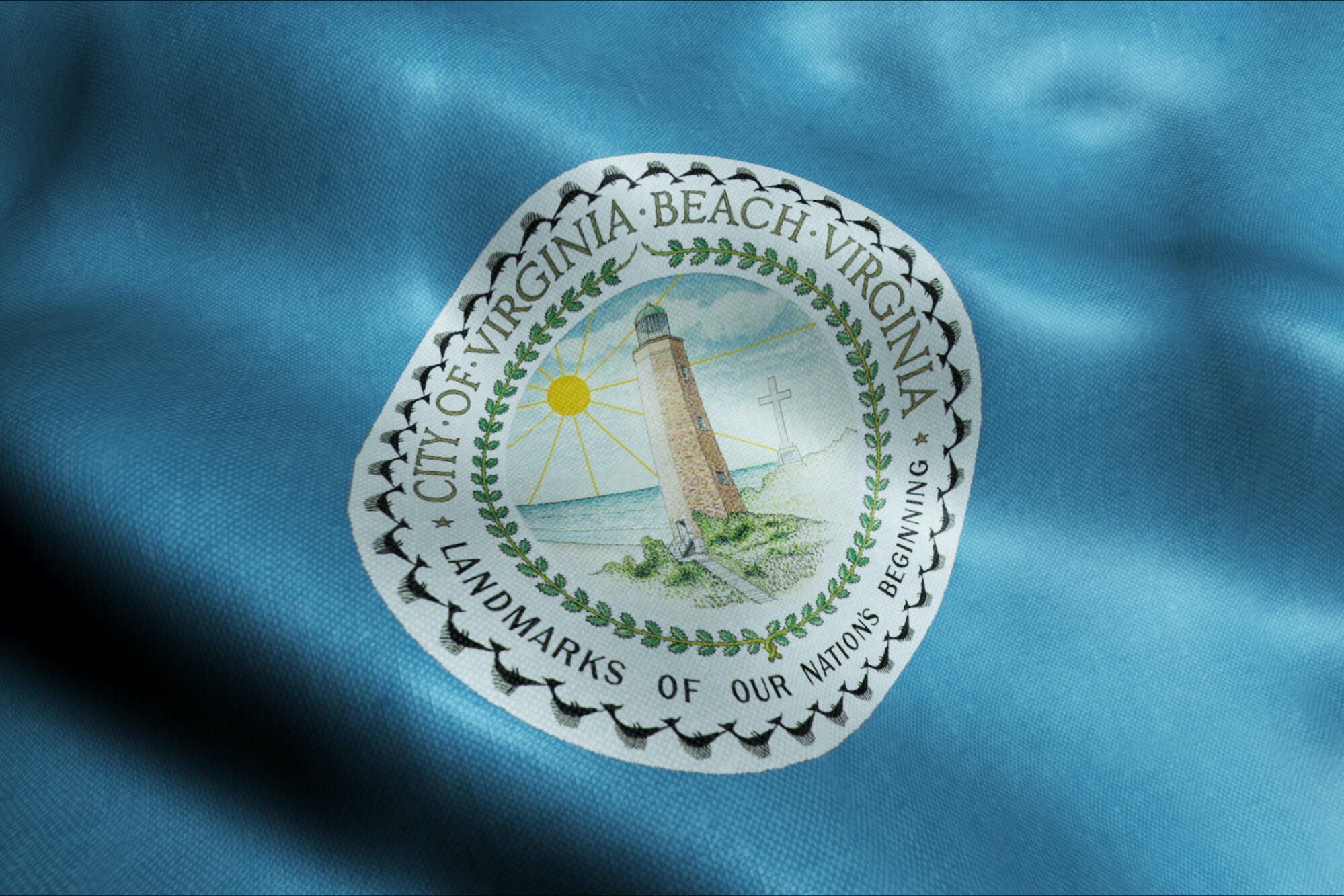
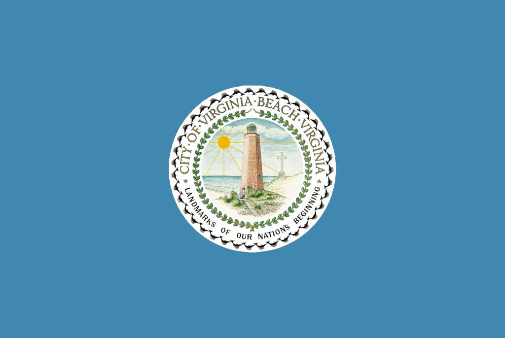
City of Virginia Beach
While the city of Virginia Beach flag contains meaningful symbolism, it’s actually too much, said sophomore Julianna Sigler.
“The complex city seal is greatly shrunk down onto the flag and many of its details are lost as a result,” said Sigler, who is from Lynchburg. “The elements on the seal are too complex.”
Central designs are the Cape Henry Lighthouse, an important symbol of the first settlers in America and the first lighthouse to be approved by the Continental Congress, and the ocean, which symbolizes the importance of tourism and water recreational activities to Virginia Beach.
Sigler’s design includes the colors of the original Virginia Beach flag, turquoise and yellow, that symbolize the ocean waves as well as the sandy shore. Similar to the original, the communication arts major’s design includes the Cape Henry Lighthouse, but she chose to feature the new Cape Henry Lighthouse, built in 1881, to showcase the development and improvement of Virginia Beach since the first settlers. The four stars recall the Naval Air Station Oceana seal, with each star representing a military installation in Virginia Beach.
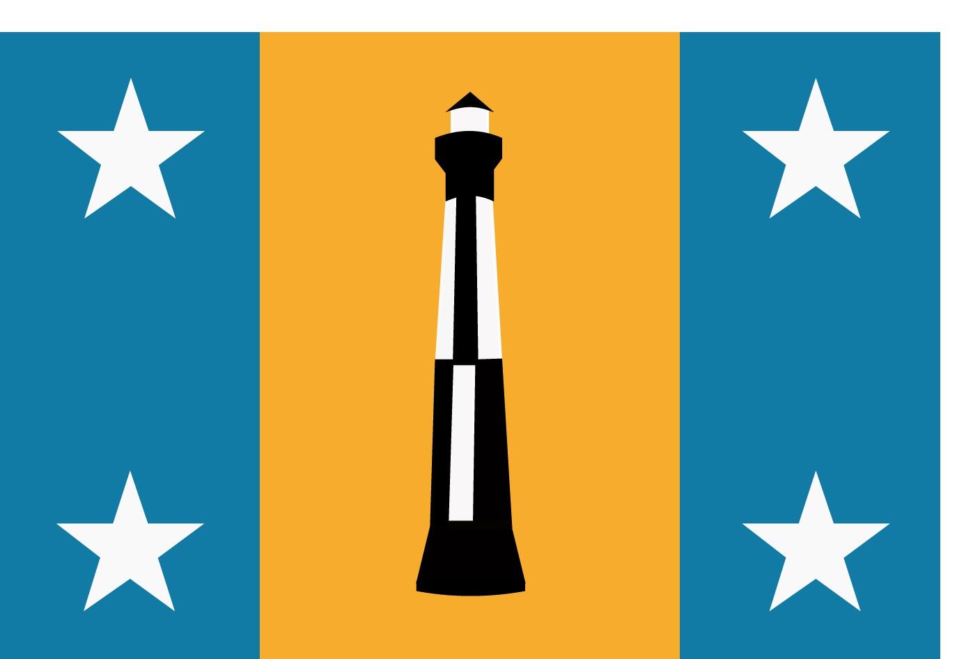
“The updated flag is able to represent the importance of the ocean to Virginia Beach industries, the rich history of the first colonists in America and the workforce of the largest naval base in the world,” Sigler said.
Subscribe to VCU News
Subscribe to VCU News at newsletter.vcu.edu and receive a selection of stories, videos, photos, news clips and event listings in your inbox.